
Page 126 - HTML5
P. 126
To refresh the page every five seconds, add this meta element in the head element:
<meta http-equiv="refresh" content="5">
CAUTION! While this is a valid command, it is recommended that you do not use it because of its
negative effects on user experience. Refreshing the page too often can cause it to become
unresponsive, and often scrolls to the top of the page. If some information on the page needs to
be updated continuously, there are much better ways to do that by only refreshing a portion of a
page.
Mobile Layout Control
Common mobile-optimized sites use the <meta name="viewport"> tag like this:
<meta name="viewport" content="width=device-width, initial-scale=1">
The viewport element gives the browser instructions on how to control the page's dimensions and
scaling based on the device you are using.
In the above example, content="width=device-width means that the browser will render the width
of the page at the width of its own screen. So if that screen is 480px wide, the browser window
will be 480px wide. initial-scale=1 depicts that the initial zoom (which is 1 in this case,
means it does not zoom).
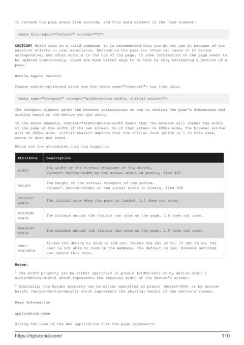
Below are the attributes this tag supports:
Attribute Description
The width of the virtual viewport of the device.
width 1
Values : device-width or the actual width in pixels, like 480
The height of the virtual viewport of the device.
height 2
Values : device-height or the actual width in pixels, like 600
initial-
The initial zoom when the page is loaded. 1.0 does not zoom.
scale
minimum-
The minimum amount the visitor can zoom on the page. 1.0 does not zoom.
scale
maximum-
The maximum amount the visitor can zoom on the page. 1.0 does not zoom.
scale
Allows the device to zoom in and out. Values are yes or no. If set to no, the
user-
user is not able to zoom in the webpage. The default is yes. Browser settings
scalable
can ignore this rule.
Notes:
1 The width property can be either specified in pixels (width=600) or by device-width (
width=device-width) which represents the physical width of the device's screen.
2 Similarly, the height property can be either specified in pixels (height=600) or by device-
height (height=device-height) which represents the physical height of the device's screen.
Page Information
application-name
Giving the name of the Web application that the page represents.
https://riptutorial.com/ 110
